When couples start looking at custom dog wedding details, the first question is usually about the illustration: "Will it actually look like my dog?" The second question, which comes up less often but matters just as much, is whether to use an illustration at all, or just print a photo directly onto the napkin or cup.
They seem like equivalent options. They are not. Here's why it matters, and what actually makes the difference between a bar detail that looks designed and one that looks like a promotional item.

What Happens When You Print a Photo
Printing a photograph directly onto a cocktail napkin or acrylic cup is technically possible. The results vary widely, and the problems are predictable.
Cocktail napkins are absorbent paper. Photo printing on paper requires ink saturation that affects how the image sits on the surface -- you often get colors that look fine in the proof and muddy in person, or detail that appears sharp on screen and soft once it's printed at scale. The paper stock that looks luxurious in hand reads differently once it has ink distributed across it.
Acrylic cups have the opposite problem. The surface is smooth and unforgiving, which means any imperfection in the original photo -- slight blur, inconsistent lighting, a background that competes with the subject -- gets reproduced exactly. A photo that looks fine on your phone looks clinical, flat, or promotional on a frosted cup.
The deeper issue is context. A photograph is documentation. It's a record of a specific moment. On a cocktail napkin at a wedding, documentation reads as a snapshot -- something grabbed from your camera roll and printed, which is exactly what it is. That's not necessarily bad, but it doesn't read as a design decision. It reads as a shortcut.
What an Illustration Does Instead
A hand-drawn illustration is a translation, not a reproduction. An artist looks at your dog -- at their actual likeness, their specific markings, the way their ears sit, the expression they make when they're paying attention -- and renders that into something that has visual warmth and intention.
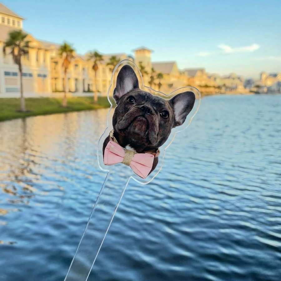
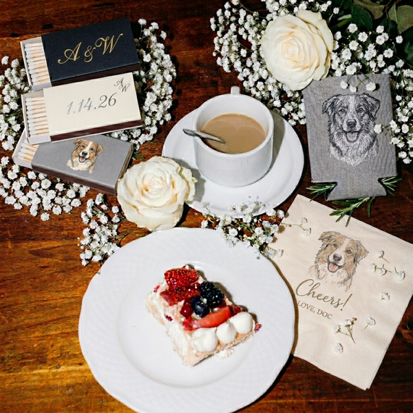
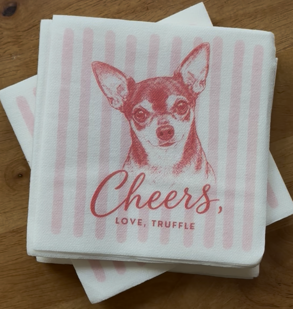
The result looks like it was made, not printed. It has style -- a consistent line weight, a particular rendering of fur texture and expression -- that holds up across formats. The same illustration that works on a 5-inch cocktail napkin also works at the top of a 6-inch acrylic stirrer, because it was designed as an image rather than captured as a document.
This is the thing most couples don't anticipate: a good illustration captures something a photo often misses. A photo can document that your dog exists. An illustration can convey what your dog is like -- their specific energy, the tilt of their head that only the people who know them recognize. Guests who have met your dog look at a good illustration and say "that's exactly them." Guests who haven't met your dog look at it and immediately want to.
"I was worried an illustration wouldn't actually feel like Milo," said Claire W. from Charlottesville, "but it was spot on. Guests kept picking up the napkins to look more closely. It felt personal without being overdone -- exactly what we wanted."
The Scale Problem
Here is a practical issue that applies specifically to cocktail napkins and stirrers: the format is small. A cocktail napkin is roughly five inches square when folded. A stirrer topper is about an inch. At that scale, a photo that hasn't been specifically adapted for small-format printing loses the fine detail that makes it recognizable. You end up with a vague color arrangement rather than a clearly identifiable dog.
An illustration built for the format doesn't have this problem. The artist simplifies -- they render the essential visual information (the face shape, the coloring, the distinguishing features) and strip away what won't translate. The result is an image that reads clearly at three inches and reads just as clearly at twelve.
The same illustration that goes on a napkin goes on a stirrer and a cup. When all three are designed together, the small-format version on the stirrer and the larger version on the cup look like they belong to the same set, because they were designed as one. Three photo prints on three different surfaces rarely achieve that coherence.
The Photography Argument
The reasonable counterargument to illustration is photography: you may already have a beautiful photo of your dog, professionally shot, in perfect light, with a clean background. Why not use it?
The answer is that a beautiful photo still photographs like a photo on a printed surface. The framing, the depth of field, the way a camera captures color -- these are photographic qualities that translate well to a screen or a print hung on a wall. They don't necessarily translate to an absorbent paper napkin or a translucent acrylic cup, where the surface itself changes the visual character of whatever's on it.
More practically: a photo that exists in isolation becomes part of a designed object. If your wedding has a specific aesthetic -- a color palette, a typographic style, a visual sensibility -- a photograph of your dog will coexist with those elements without necessarily integrating with them. An illustration can be designed to coordinate. The line weight, the color treatment, the style can be calibrated to match your invitation suite or your floral palette. The result is something that looks like it was art-directed, not assembled.

When Photo Printing Makes Sense
Photo printing isn't categorically wrong for wedding details. It works well for large-format applications -- a framed portrait at the venue entrance, a photo displayed in a gallery wall, a printed program with your dog's photo included. At those sizes, the photographic qualities that don't translate on a napkin translate fine on paper or canvas.
For bar details specifically -- napkins, stirrers, cups -- illustration is the right format. The scale, the surface, and the context all favor it.
How the Illustration Process Works
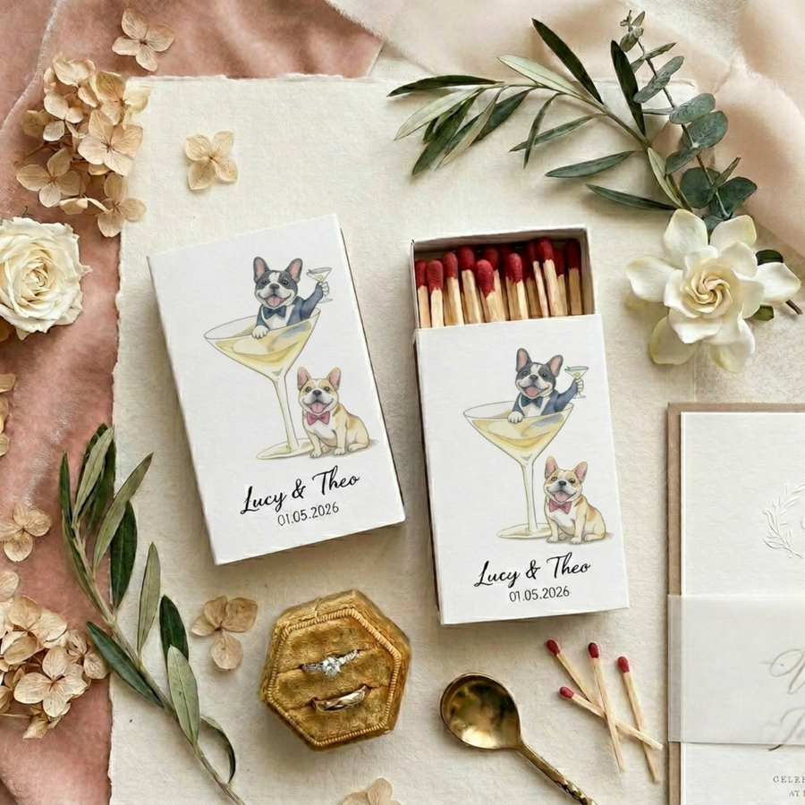
At In Every Chapter, the illustration process starts with a photo of your dog -- the best reference photo you have, ideally in clear light and showing the face directly. An artist creates a hand-drawn illustration based on your dog's actual likeness. Not a template. Not a filter applied to an existing image. A real illustration made from your dog's specific features.
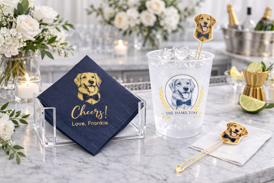
A proof comes back for your review before anything is printed. Revisions are included. When the illustration is right, it's used across every item in the order -- the same image, at the right scale for each format, so the napkin and the stirrer and the cup look like they were designed together.
The $35 illustrated preview shows you your dog on all three items before you commit to a full order. Most couples who see the proof order without changes. A few come back with notes -- a detail about the ears, a coloring adjustment -- and those get revised until it's right.
The illustration either looks like your dog or it doesn't. That's the only standard that matters, and it's the one the process is designed to meet.