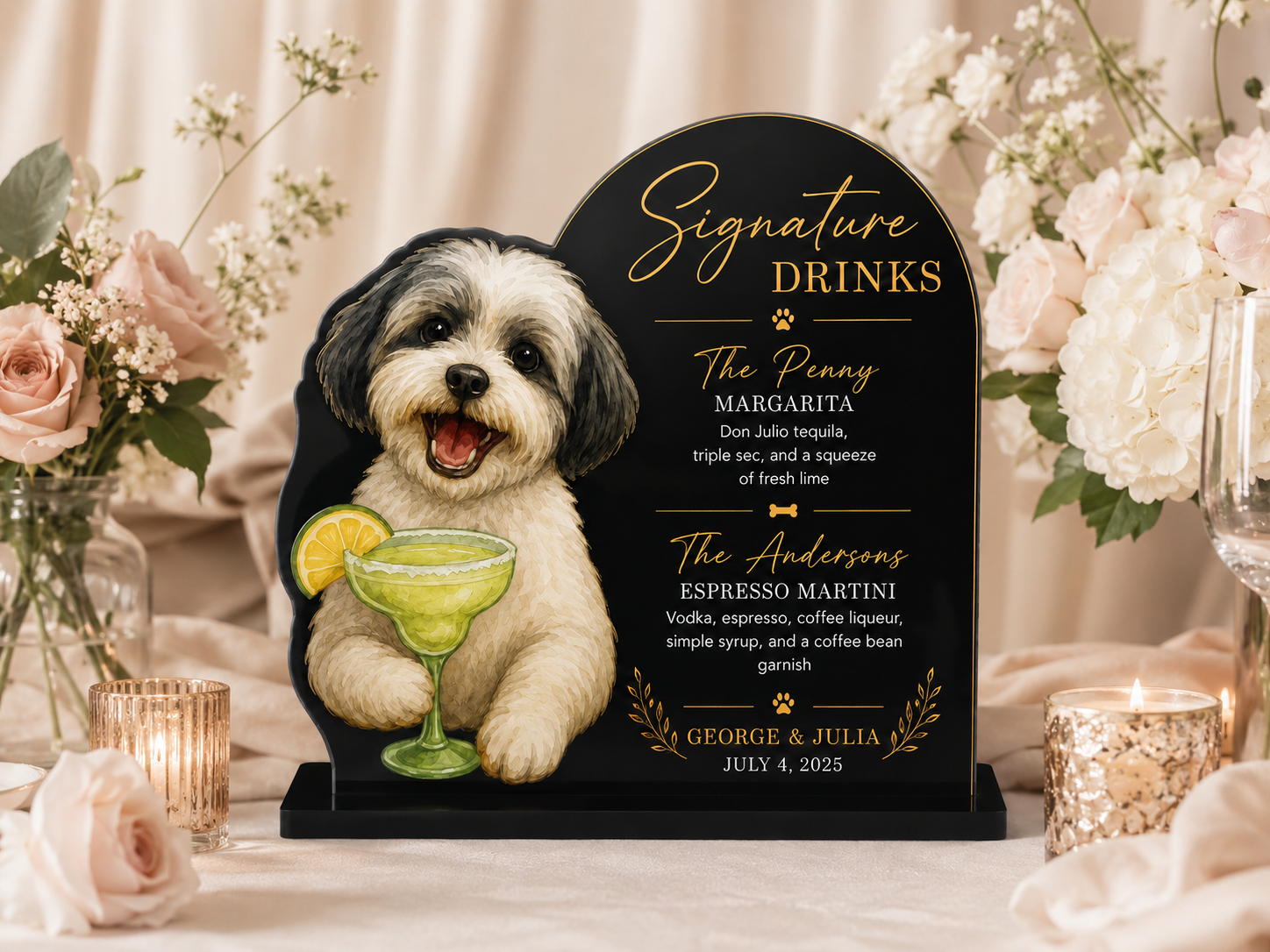
The bar sign is the one element at the wedding bar that guests see from across the room. Everything else -- the napkins, the stirrers, the cups -- gets noticed up close, when someone is already there, drink in hand. The bar sign is the first impression of the bar as a whole, and when it features your dog, it sets the tone for everything else guests are about to discover on the counter.
Done well, a dog wedding bar sign is the visual anchor that pulls the whole bar setup together. Done poorly, it's a piece of foam core with your dog's photo printed on it, propped against the back of the bar, slightly crooked, slowly curling in the humidity.
Here's how to get it right.
What a Bar Sign Actually Does
A bar sign at a wedding serves two functions. The first is informational -- it tells guests what's being served, names the cocktails, and gives the bar some structure so guests aren't squinting at unlabeled bottles. The second, and more important, function is decorative. It's a backdrop for bar photos, an anchor for the arrangement of items on the bar surface, and a signal to guests that the bar was thought about, not just set up.
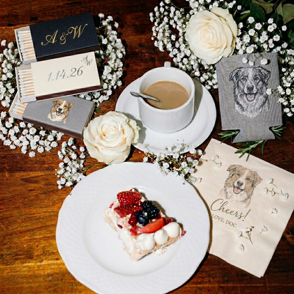
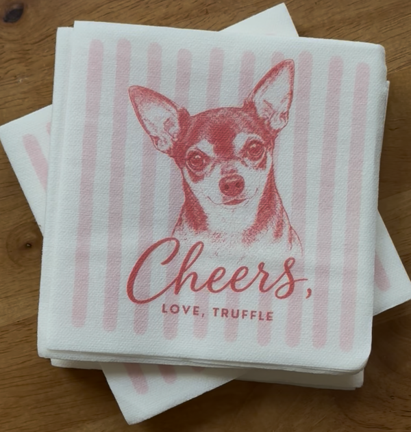
A dog wedding bar sign takes on a third function: it introduces your dog to the bar experience before guests even pick anything up. Someone who sees your dog on the sign, then picks up a napkin and sees the same illustration, then looks at their stirrer and sees it again -- that's a cohesive experience. The sign is the beginning of that story.
Format Options
Bar signs come in a few formats, and each has different strengths:
Acrylic
A printed acrylic panel is the most durable and polished option. It reads well from a distance, holds up in outdoor or high-humidity settings, and can be edge-lit for evening events. Clear or frosted acrylic with a custom illustration and typography has a modern, upscale look that photographs especially well.
Wood
Laser-engraved or printed wood signs have warmth that suits barn, garden, and rustic venues. The illustration style needs to be considered in relation to the material -- a detailed color illustration can be printed on a wood surface, but a clean engraved line illustration often looks more intentional on this format.
Framed Print
A large framed print behind the bar is simple and flexible -- you choose the frame to match your venue aesthetic, and the print inside can be full-color and detailed. The limitation is that it requires a surface to stand on or a way to hang it, which not every bar setup accommodates easily.
Chalkboard
A chalkboard with your dog hand-lettered onto it works if you have someone who can actually execute it. Chalkboard art varies enormously in quality, and at a wedding, the difference between a chalkboard that looks like a professional lettering artist did it and one that doesn't is immediately visible in every photo. If you're going chalkboard, hire a professional lettering artist to execute it.
What to Put on a Dog Bar Sign
The most effective bar signs are simple. They have your dog's illustration, the cocktail menu (if you're serving specific cocktails), and minimal additional text. The illustration is the star. Typography and other design elements support it -- they don't compete with it.
Elements that work:
- Your dog's illustrated portrait, prominent and clear
- A short header ("The Bar," "Welcome to the Bar," your dog's name and a year, or simply nothing)
- The cocktail menu, if you have one -- drink names, brief descriptions
- A single line of type acknowledging your dog, if that feels right ("Hosted by Biscuit," or "Biscuit's Bar")
Elements to skip:
- Long text blocks -- guests don't stop to read them at the bar
- Hashtags -- they read as promotional rather than personal
- Too many competing graphic elements -- a border, a crest, a monogram, and the illustration is too much; choose two
Making the Sign Work with the Rest of the Bar
A bar sign isolated from the rest of the bar setup reads as a single decision. A bar sign that shares its illustration with the napkins, stirrers, and cups on the counter reads as a designed bar. The difference is coherence: when every element at the bar features the same rendering of your dog, done by the same artist in the same style, guests experience the bar as a whole rather than a collection of separately ordered items.
The bar sign is most effective when it's ordered from the same source as the other bar elements -- or at minimum, when the illustration used on the sign is the same file as the one used on the napkins and cups. Consistency in illustration style is what makes the bar feel designed rather than assembled.
Size and Placement
A bar sign should be readable from six to eight feet away -- far enough that guests approaching the bar can orient themselves before they arrive. For most standard bars, that means a sign at least 12 inches tall and 16 inches wide. Larger is usually better: a bar sign that's too small gets lost in the arrangement of glasses, bottles, and flowers on the counter.
Placement matters. A sign propped at the back of the bar, behind bottles and ice buckets, is hard to see and easy to obscure. A sign with its own stand or riser that puts it slightly above the level of the items on the bar surface gets visibility. Some couples hang the sign on the front face of the bar itself, at eye level for guests walking up. That placement is visible from farther away and photographs well because the bar surface and the sign are both in frame.
The Bar Sign as Part of a Larger Package
The bar sign does its most effective work as part of a full bar setup: sign, napkins, stirrers, and cups all featuring the same illustration. When all of those elements come together, the bar stops being a functional necessity and becomes a focal point -- a visual statement about your dog, executed consistently across everything guests touch.
In Every Chapter's Bar Package starts with a hand-drawn illustration of your dog, then applies it across napkins, acrylic stirrers, and frosted cups as a cohesive set. Bar sign design coordination is available as part of the package -- the same illustration file, sized and adapted for the sign format, so the whole bar looks like it came from one place.
Because it did.